When it comes to creating scripts, whether for invitations, branding, or personalized engravings, the font and spacing you choose can make all the difference. A script is more than just a style; it’s a visual representation of your message, tone, and even the emotion behind it. At AW Jewelry, we understand that every detail matters, especially when it comes to crafting messages that are meant to be cherished for years to come.
When it comes to legibility and grace, there’s more than meets the eye. A well-chosen font combined with the right amount of spacing can transform a script from difficult to read into something elegant and inviting.
How Does The Choice of Font Impact Script Legibility?
Font choice is the foundation of a script’s legibility. The right font creates harmony, readability, and a tone that complements the content, while a poor choice can make a script hard to read and unpleasant to look at. A script font with intricate flourishes might look beautiful, but if it’s too ornate, it can reduce legibility, especially in smaller sizes.
When choosing a font for scripts, you want to balance beauty with readability. More traditional script fonts, like those used in calligraphy, often offer a graceful feel while remaining legible. However, overly decorative fonts can blur the letters together, making it hard to decipher words. A simple, elegant script with clear lines ensures the reader can enjoy the beauty of the design without straining to read the words.
Why Is Spacing Crucial for Graceful Script Design?
Spacing is as vital to script design as the strokes themselves. Clean, deliberate spacing, between letters (kerning), between words, and between lines, lets the hand-drawn rhythm read with ease.
When spacing is too tight, letters bump and tangle, creating a busy, cluttered texture that tires the eye. When it is too loose, the script loses its connection; the word breaks apart and begins to feel hesitant or awkward.
The goal is balance: enough room for each character to breathe, yet close enough to preserve the natural joins and forward motion of the writing. Done well, spacing supports consistent flow and invites the reader to follow the line effortlessly, so the script feels graceful, refined, and seamless from first glance to final word.
How Does Font Size Affect Script Readability?
Font size is one of the quiet decisions that determines whether a script feels effortlessly readable, or frustrating to decipher.
Why Size Matters:
Font size directly impacts the legibility of your script. Ornate script fonts may look beautiful at larger sizes, but they can quickly become unreadable when scaled down, especially if the letterforms are highly decorative or tightly detailed. That’s why it’s essential to test your chosen font at multiple sizes to ensure it stays clear, no matter where it appears.
Match the Font to the Format:
When designing invitations, engravings, or any piece that uses script, consider both the type size and how much you need to say. Longer passages usually call for a simpler style (and a touch more size) so the reader can move through the words with ease. Short quotes or brief phrases can support more decorative details, since the message is quick to take in and won’t feel visually overwhelming.
When scale and style work in harmony, the script doesn’t just look elegant, it reads with ease, carrying your message smoothly from first glance to final word.
How can You Maintain Elegance while Ensuring Legibility?
Elegance and legibility in script typography require a careful balance, so make each choice with intention. Start with a script that has a clean structure, open letterforms and steady stroke contrast, while keeping flourishes restrained and purposeful. Avoid overly tangled loops, and always test your selection in print at the exact sizes you’ll use.
Spacing is the second half of the equation. Thoughtful kerning and comfortable letter spacing keep characters from colliding, helping each word read in a single glance. For engraving or invitations, scale matters, when the type gets small, choose a simpler script so fine details don’t blur and words don’t merge.
For longer passages, use a crisp serif or modern sans-serif for the main text, and reserve script for names, headings, or short focal lines. When the hierarchy is thoughtful, the piece feels refined and easy to read, putting the reader first, and letting beauty arrive as a quiet finishing touch.
Why Should You Consider Context When Choosing Font and Spacing for A Script?
The context of where the script will live matters, because each setting changes what will read clearly and what will feel refined. Let the medium guide your lettering style and layout choices, so the message stays graceful, not strained.
- Wedding Invitations:
- A wedding invitation might call for a more formal, flowing script with delicate spacing to evoke elegance and romance.
- This type of script creates a sense of sophistication, ideal for conveying the tone of such a special event.
- A wedding invitation might call for a more formal, flowing script with delicate spacing to evoke elegance and romance.
- Brand Logos or Product Engraving:
- A more contemporary piece, such as a brand logo or product engraving, might benefit from a clean, bold script with more structured spacing for better legibility.
- This ensures the text is clear and professional, especially when used in commercial applications.
- A more contemporary piece, such as a brand logo or product engraving, might benefit from a clean, bold script with more structured spacing for better legibility.
- Long-form Writing or Formal Invitations:
- For longer passages or formal invitations, it’s essential to choose a font and spacing that are not only beautiful but also practical for the medium.
- The text should be easy to read and aesthetically pleasing, without overwhelming the reader.
- For longer passages or formal invitations, it’s essential to choose a font and spacing that are not only beautiful but also practical for the medium.
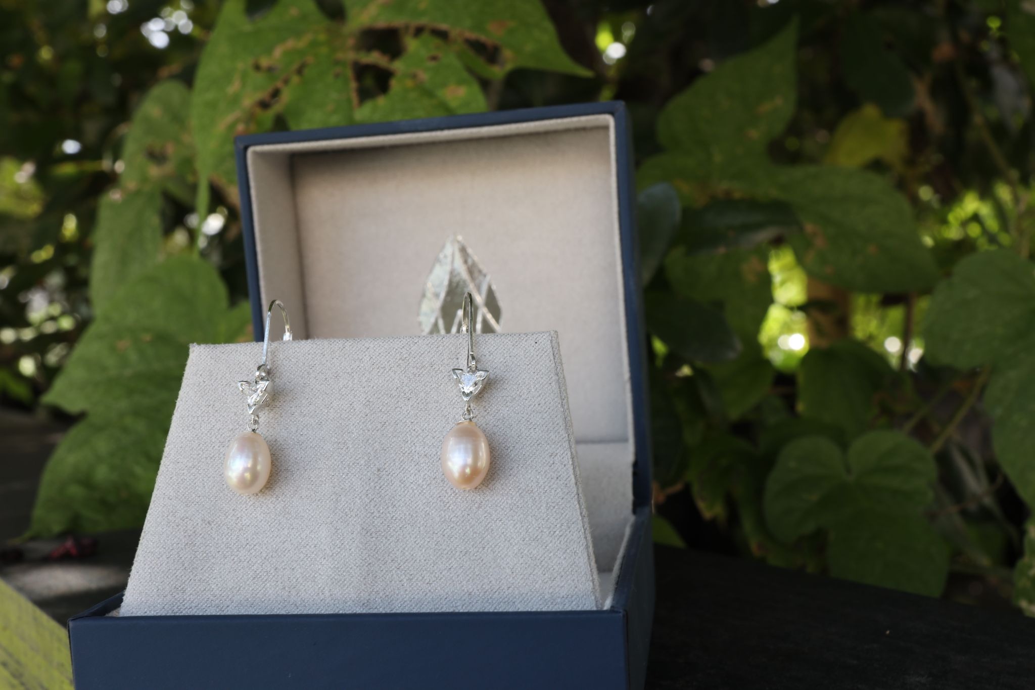
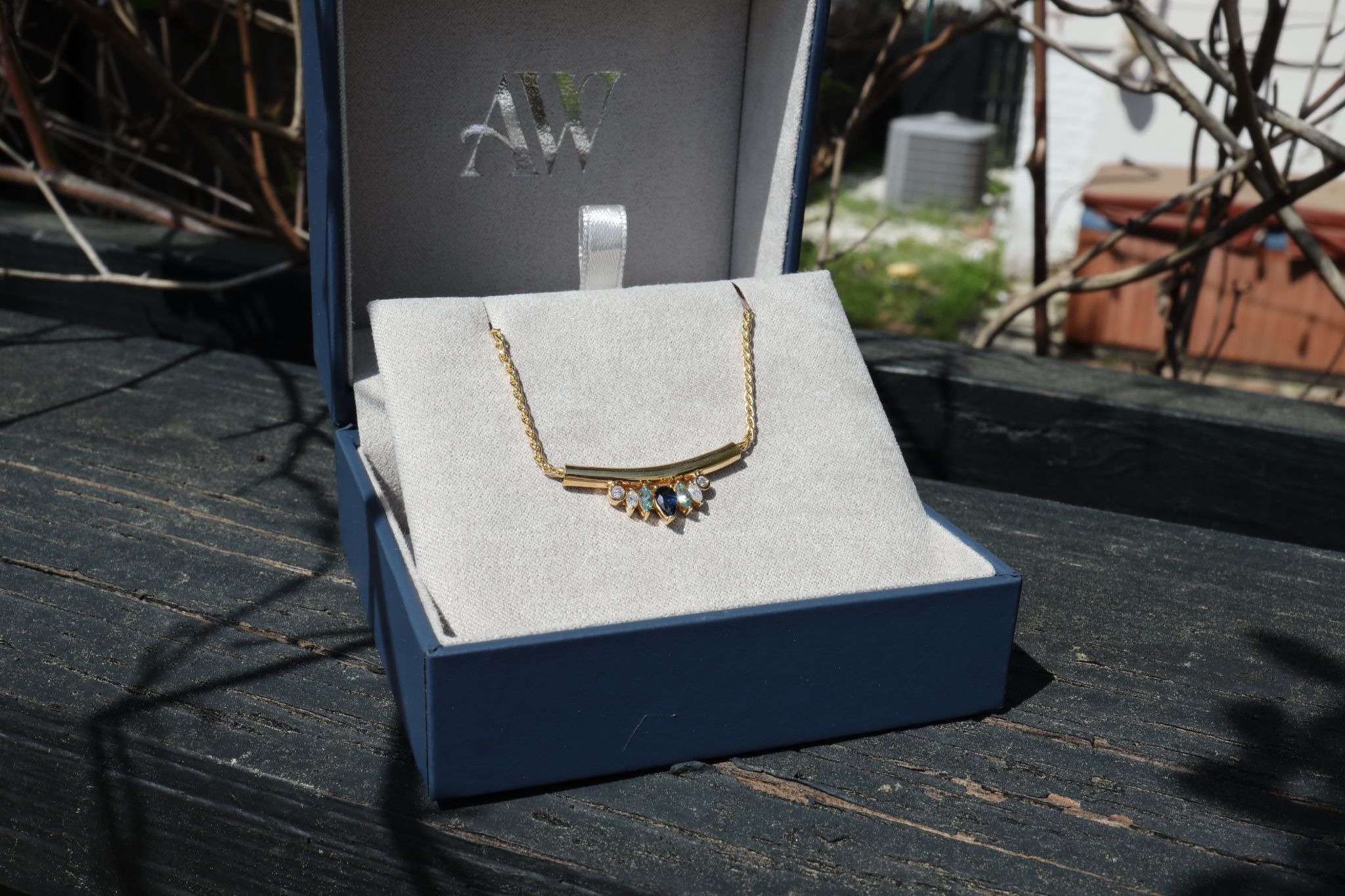
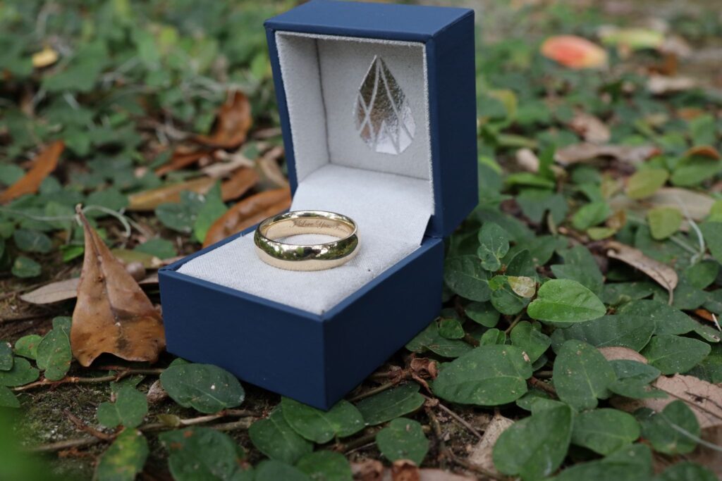
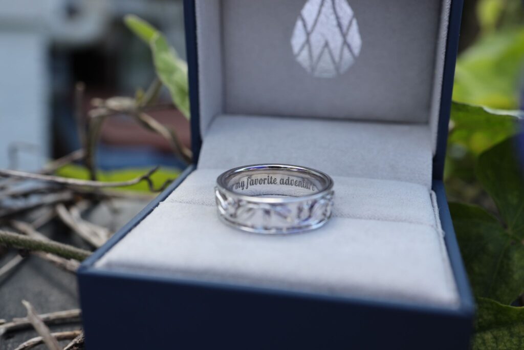
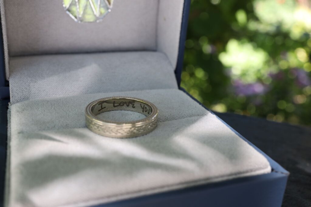
- Engraved Jewelry:
- Engraved jewelry often uses scripts with clear, bold letters and thoughtful spacing, ensuring the engraving remains legible on small surfaces while still conveying elegance.
- This ensures your design looks beautiful and readable even on delicate jewelry.
- Engraved jewelry often uses scripts with clear, bold letters and thoughtful spacing, ensuring the engraving remains legible on small surfaces while still conveying elegance.
How Does Font Choice Impact The Tone of A Script?
The type style you choose can shape the tone of your message as much as the words themselves. A flowing, calligraphy-inspired script can suggest romance and ceremony, making it a natural fit for invitations, wedding details, and personal notes. Its gentle curves often feel traditional and refined, setting the mood for meaningful moments.
A cleaner, simplified script creates a more modern impression. It suits contemporary brands, casual events, and designs that need a streamlined feel; clear, confident, and easy to read without losing character.
Context is everything. Whether you’re aiming for playful, elegant, or bold, your lettering choice sets the emotional foundation. Select a style that matches the mood you want to convey, and your message will land with clarity and beauty.
How can I Test Font and Spacing before Finalizing My Design?
Test your type choice and layout before you commit. Preview it at true size in the final design. Print or mock it up, then adjust until it reads effortlessly.
Test Your Font and Spacing in Real-World Formats:
Before you finalize your design, test how your selection reads in the real world. Print a sample at the intended size, especially for invitations or jewelry, to see how the script translates in physical form and holds its clarity.
Experiment with Space and Formats:
Testing your text in multiple formats shows how well it performs across different mediums. Try small adjustments to letter and line gaps to find the most pleasing, readable version of your script. Then refine size and alignment until the layout feels balanced and clear.
Seek Feedback for Clarity and Elegance:
If you’re unsure, ask a second set of eyes to check clarity and overall feel. A quick test run helps prevent surprises and ensures the final piece looks polished, balanced, and right for its purpose.
By testing your script style and layout, you make sure the design isn’t only beautiful, it’s usable. This step is essential for a finished result that reads with ease and carries elegance across any medium.
What Are Some Common Mistakes to Avoid When Choosing A Script Font?
There are several common mistakes to avoid when selecting a script style. One of the biggest pitfalls is choosing lettering that’s too ornate or complex, which can make the text hard to read, especially at smaller sizes. Another frequent issue is neglecting spacing; too little room between letters or words creates a cluttered look and makes the message harder to decipher.
Additionally, inconsistent type styles or mixing too many decorative elements can make a design feel disjointed. To avoid these problems, always test your selection for legibility and make sure it suits both the character of your piece and the medium where it will appear. Keeping the script elegant yet readable is the key to a successful design.
At AW Jewelry, we know every detail, whether an engraving or a custom design, should reflect your personal style with clear intention. The script style and layout you choose shape how your message is received: graceful, legible, and lasting. When letterforms and breathing room are in harmony, the design doesn’t just look beautiful, it reads effortlessly, whether it’s etched into jewelry or printed on an invitation.
Ready to craft a beautiful and readable script for your jewelry or special occasion? Connect with us for a personalized consultation online, or come visit our studio to start creating the perfect custom design.